Maple Bay Hop Farm
Logo & Web Design
Year: 2017
Art Direction, Logo Design, Illustration, Web Design
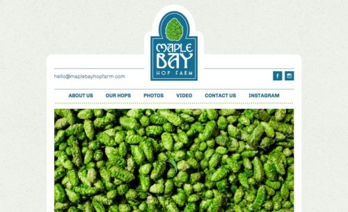
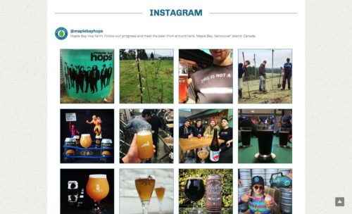
For Maple Bay Hop Farm the brief on this logo design project was simply “something that captures the essence of West Coast (BC) living”. From that initial brief a number of logo concepts came about (see early drafts below) until two logo designs were completed: a main logo with a hop graphic stacked on top and secondary logo with the same elements in a roundel. After the logo designs were completed, a simple one-page website was created with information about the hops, contact details, a photo gallery and an Instagram feed.